Another post of mini-art. As I mentioned previously, the official on-line challenge for Index-Card-A-Day ended on July 31st. (If you missed the explanation of this project, you can read about it HERE.) I decided to continue through the end of the summer. I wrote author, title and date on the back of a card each day, but finally finished all of the art on the cards last night. In a few more days I will take some photos of the entire stack of 90something cards and make one final post for the project.
Here is the last installment of mini-art cards and the reading they represent:
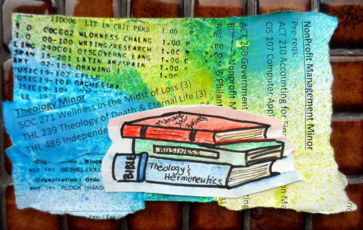
Applying to Ohio Dominican University–a day of reading Transcripts, Course Descriptions, and Degree Requirements!
I tore out pieces from transcripts and degree requirements and collaged them onto the card. I masked different sections and used Dylusion Ink sprays (green and blue). While that was drying, I sketched a stack of books on a different card, colored it in with watercolor crayons, and cut it out. I attached it to the original card with glue dots to add a bit of dimension.

“Weird Things Customers Say in Bookstores” by Jen Campbell
Customers apparently really do say very weird things to bookstore clerks. This book is a collection of anecdotes. You can read some of the interchanges on the author’s blog HERE. It took me quite awhile to figure out what I wanted to do on this card to represent the book. Finally I decided to sketch a talking mouth. (I went to the bathroom at the S*Bux to draw my mouth as seen in the mirror!) I colored it with watercolor crayons and drew some of the color across the card when I brushed with water. Then I added words with a variety of colors of scrapbooking markers.
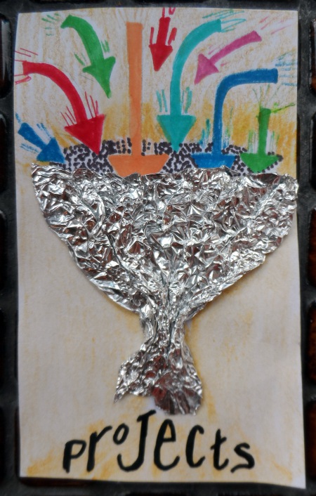
“Making Ideas Happen: Overcoming the Obstacles Between Vision and Reality” by Scott Belsky
Another difficult book to illustrate. I chose to represent a diagram from the book that showed how to effectively sort out brainstormed ideas into do-able projects. I sketched the basic funnel shape with pencil, then glued crumpled aluminum foil over the sketch. I added arrows and words with scrapbook markers. Then I added a thin layer of background color with watercolor crayons.

“The Kitchen Daughter” by Jael McHenry
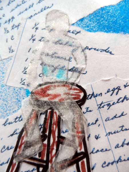
detail of “ghost” sitting on the stool
This book was a gripping account that felt (mostly) like a non-fiction account of a young woman with severe asperger’s facing the sudden death of both parents. As she cooks for comfort, she discovers that the person who wrote out the recipe she was following would appear on her kitchen stool to give her warnings, advice, or comfort. To make this card, I sprayed the background with Dylusions Ink spray. I color-copied a cookie recipe from my mom and tore it into sections to layer onto the card. I drew a stool (colored with markers) onto another piece of card and cut it out. Finally, I traced the figure of a person sitting on the stool onto a piece of tissue paper. I cut that out, glued it to the card, and covered the “ghost” with iridescent glitter. I LOVE how this card turned out!

“The First Warm Evening of the Year” by Jamie Saul
I know! I know! This is a completely cheesy image. In my defense, the book was a stereotypical, cheesy romance novel! I drew the image with watercolor crayons and added detail to the dock with a scrapbook marker.

“The Baker Street Translation” by Michael Robertson
On the other hand, I really like the simple, graphic look of this card. The book is from a series, all about bumbling British lawyers who have an office at 221 Baker Street. They accidentally solve crimes based on mail addressed to Sherlock Holmes. To make the card, I sketched the silhouette of Sherlock Holmes. I was going to make it entirely black, but really liked how it looked with just the outline so I left it that way. I sketched the magnifying glass and the rubber ducky, trying to make the duck look larger in the glass. I colored everything with watercolor crayons. (You will have to read this lighthearted mystery to figure out the significance of the ducks!)

Variety of Children’s Books about the WWII Home Front
In preparation for a homeschool unit study on WWII, I read through a number of children’s books. To make this card, I added saturated swirls of red and blue to the card with watercolor crayons as a background. I color copied (and significantly shrank the size of) a variety of images from the books which I cut out and collaged onto the card. After everything was dry, I added some outlines and a few stars with a gold paint pen.

Mythlopedia series by Scholastic Books
This is an awesome series of children’s books about Greek/Roman mythological stories and characters. (Another project for homeschool this year.) This card represents Mt. Olympus, home to the gods. First, I did a rough sketch in pencil. I added color with watercolor crayons and quickly sketched the temple with a scrapbook marker (going over the pencil marks). Finally I cut out a few clouds from tissue paper and glued them to add a touch of mystery to the area of the gods.

“Being Dead Is No Excuse: The Official Southern Ladies’ Guide to Hosting the Perfect Funeral” by Gayden Metcalfe and Charlotte Hays
This funny and irreverent book is even more enjoyable if the reader has spent some time living in the South. Many of the recipes are yummy, comfort food. I thought about doing something with the recipes or with a cooking theme, but decided to highlight the setting by making a Tara-like plantation on the card. I cut out a background section from a leftover scrap of paper covered with Dylusion Ink overspray from another project. I also tore out a few bits of “leaves/treetops” from that paper. I drew a plantation house on a separate card, outlined it with a scrapbook marker, cut it out, and collaged it onto my background. I drew tree trunks and branches with the marker, added a layer of “treetops”, drew more branches, and added another layer of “leaves,” with extra branches drawn over everything. I wish I could have figured out how to add some spanish moss draped from the branches!

“After the Death of a Child: Living with Loss through the Years” by Ann Finkbeiner
After the death of her son, the author set out to write the book she wishes had been available when she needed it. It is an excellent look (through interviews and anecdotes) at the grieving journey parents are still traveling years after a child’s death. To make this card, I colored the background with dark watercolor crayons. I cut out tiny squares of scrapbook paper in a variety of colors, ranging from light to dark. I made a mini calendar, then wrote dates on each calendar “page” with a scrapbook marker. I made the darker pages further in the past, trying to show that life feels a little less dark and a little less heavy as years go by. I chose the dates I did because we had a son who died in 2008.

“Is It Still Me? Or Is It Nuts Out There?” by Whoopi Goldberg
This book is a series of short (1-2 page) essays by the author, ranting about the loss of manners and etiquette in today’s culture. To make this card, I went looking online for photos of Whoopi. I sketched one I liked with a funky jacket collar from a different photo. I added color with watercolor crayons. I didn’t include any hair in the painting. Once everything was dry, I cut some lengths of textured yarn, tied it together in the center (like a “part”), and glued it onto the page, leaving the ends of the “dreadlocks” loose to move around. I love the way this one turned out!

“a friend called anne” by Jacqueline van Maarsen, retold for children by Carol Ann Lee
Anyone who knows me, knows I hate stories (books or movies) with sad endings. So it will come as no surprise that I hated the Diary of Anne Franke when I was a kid. On the other hand, although far too many of her friends and family members died in concentration camps, this book is filled with happy moments and happy memories. It was written by one of Anne Franke’s best friends. To make this card, I desaturated a photo taken in Amsterdam this winter, then printed the photo on plain paper. I cut it out and glued it to the card. After internet research, I drew a Jewish Star (from the Netherlands) onto a torn piece of tissue paper. By saturating the watercolor crayon paint, outlining the star with “stitches” drawn with a scrapbook marker, and allowing the tissue paper to wrinkle slightly when I glued it to the background, the star looks almost like it is made of fabric. I really like the ethereal, dream-like look of this card–a way to remember tragedy without being in-your-face dark horror.
And here’s the final book of my summer reading and art project:

“My Grandfather’s Clock” by Jack Bacon
With short stories, this book follows 28 generations of the author’s family history through time. To make this card, I cut out and glued on a rustic background cut from scrapbook paper. Then I layered a variety of time-related stickers. It was quite simple to make, but I like the finished result.
It’s hard to believe I stuck with this and actually completed a piece of mini-art for every day of the summer! I can’t wait to share a few photos of the whole collection of cards…sometime in the next few days, I promise…
